Friday, November 5, 2010

How to build an effective website design


The first step into creating a website design is to know your segmentation and understanding your target market. Once you have these two pointed out it is easier to recognize what type of design style will be more effective for your website.   For example, if your product or service targets seniors older than +65 you know you can’t use a design too colorful or non-traditional layout to navigate because otherwise your prospect clients will not be able to operate your website correctly or find the information they are looking for, making your website a major failure.
In the opposite hand, if you are targeting young audiences then you know you need to keep them entertain, meaning you want music, movement, interaction, colors and unexpected layouts in your website.
Always be objective, because a great looking design doesn’t necessarily means an effective website; always put your audience first and create a design that will suit them and not just your design “desires”.  

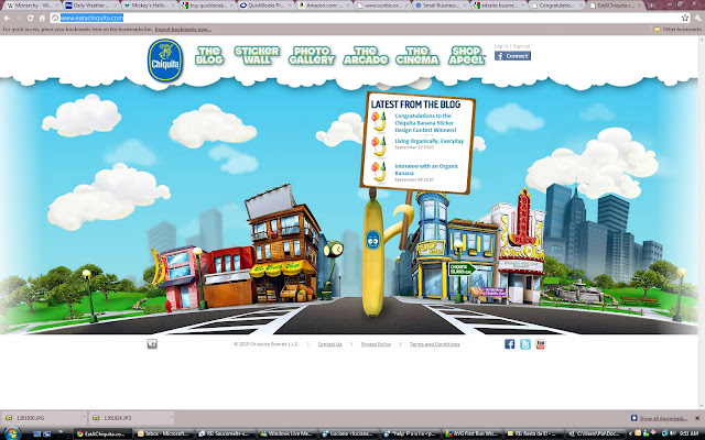
Some examples of great website design:


Some examples of great shock advertising

Surprise or shock advertising is one of my favorite subjects. I believe that when done tastefully (or if not completely tasteful, graceful will do) these can be very effective.

Shock advertising is used to get an immediate reaction from the viewer at the exact moment his/her eyes are laid on the ad. This a really good technique that is often utilized to create awareness about social problems that most people would rather not know about, but besides social responsibility it is also really effective for every day products and brands when it is mixed with some humor. So some agencies have taken care advantage of this resource and put together some outrageous but awesome campaigns.


I have put together a list of some great ads that will immediately capture your attention while communicating a specific message.

1.Hair Color Surprise This ad also contains a metaphorical message but it is certainly a surprise when you look closer and realize the strands of hair are composed of a pantone color palette.


ssss

2. Pantene:  "Danduff is not appetizing" .  This was such a smart approach on dandruff, specially at lunch time but i am certain that everybody got the message!


3. Interbest Outdoor: "The sooner you advertise here, the better". So effective that i am posting it in my blog to find them an advertiser ASAP!

4. Todays forecast:


to flash or not to flash

Ever since the beginnings of flash, the question of whether flash was good of bad for website design has been circulating. The truth is that most web designers are more confused than everybody else. You can go online and find forums with dozens of hundreds of people arguing endesly around the same topics.

Today I am going to give my take on it.
A flash movie is like an image, browsers will not be able to read anything on it. So if a website is full flash, a search engine will not be able to read anything from it. However, there are ways around it : just create the HTML with all the content and keywords and then place it as alternate content using a JS code. (for the code go here: SWF Object).
Once the search engines have code to read, then flash is not a problem anymore!
And if you really think about it, flash can do lots of things plain HTML cannot.
Find a couple of great examples of flash websites below:


If after visiting the last 3 websites, you still think flash is going to dissapear.. all i can say is :   I don't think so buddy!

Some great logo practices

Design tends to be a lot like fashion, every year there are new trends that designers follow in order to create original but relevant concepts for new brands or businesses.

There are a number of great logo practices and i will be discussing just a few of them today.

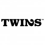
1, One of my favorite things to do with logos is to have it visually communicate what the name says in a witty way. The two logos below (Killed productions and Twins) are a great example of that. Both logos are pretty simple in their design but the brand concept is brilliant. I have seen these two logos more than one year ago for the first time and i still remember both brands. I guess they have fulfilled their purpose. 


2. Other great examples of the same type logo design are Peeled and Danzk, although these two require a little more photoshop skill than the first two.


3. On wine is a great example of how to incorporate great use of symbols, fonts and the right message immediately. It is elegant, relevant, readable and definitely memorable.


4. Natasha Balabanova uses bold colors and a floral pattern. Floral was very in during 2009 and 2010 but it is becoming a little over rated, however Natasha Balabanova has been able to achieve a balance of relevancy and the use of this popular technique. 


5. Ikebana: Can't go wrong with some beautiful custom font. Ikebana is girlie and balances the warmness of the yellow background color with the pink flower  accent that gives it the finished look.


5 great examples of business cards

Back in the day, business and marketing people were limited to picking from a few font options and a couple of paper stocks for the business cards which made it very hard for a company or individual to stand out from the crowd.... Well, except for these guys (FF to 1:40)


But thanks to advancements in computer technology, today we can choose from a variety of softwares and techniques to design our presentation cards while picking from a huge amount of paper options.
Gloss coating is almost out of fashion thanks to the new variety of printing and coating.
Today, some of the most popular trends for designing business cards go from silk coating, spot UV, foiling, die-cut, and even the most creative uses of paper, carton, rubber, and fabric.


I have put together a list with some of my some of the greatest business card designs:


1. Yoga One: great use of creative resources.


1. Dr. Hajnal Kiprov:  Another great use of die cut and creativity.


3.  James A.W. Mahon: Divorce attorney.
A great example of creativity without spending too much.


4. Glammer: Another great example of a creative business card without spending too much.


5.  Folding Chair, die cut business card.


6. Sarah Powers Media: great use of texture and shape.


7. Business cards to lose the tummy!


8. Windsor Assurance:  Foil and raised logo on thick paper.


9. Zoo: Green Plastic. Texture and material can cause a great impact!


10. Royal Society: Silk + Spot UV 


Business cards ought to be taken seriously! .....although maybe not so much as this other guy down here: