Design tends to be a lot like fashion, every year there are new trends that designers follow in order to create original but relevant concepts for new brands or businesses.
There are a number of great logo practices and i will be discussing just a few of them today.
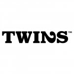
1, One of my favorite things to do with logos is to have it visually communicate what the name says in a witty way. The two logos below (Killed productions and Twins) are a great example of that. Both logos are pretty simple in their design but the brand concept is brilliant. I have seen these two logos more than one year ago for the first time and i still remember both brands. I guess they have fulfilled their purpose.
2. Other great examples of the same type logo design are Peeled and Danzk, although these two require a little more photoshop skill than the first two.
3. On wine is a great example of how to incorporate great use of symbols, fonts and the right message immediately. It is elegant, relevant, readable and definitely memorable.
4. Natasha Balabanova uses bold colors and a floral pattern. Floral was very in during 2009 and 2010 but it is becoming a little over rated, however Natasha Balabanova has been able to achieve a balance of relevancy and the use of this popular technique.
5. Ikebana: Can't go wrong with some beautiful custom font. Ikebana is girlie and balances the warmness of the yellow background color with the pink flower accent that gives it the finished look.


No comments:
Post a Comment